Objectives
Review CSS fundamentals Layout fundamentals via a series of discreet experiments. Each experiment is in a separate html/css file and explores important rules associated with the box model, layout and positioning via simple, concrete examples. Some of the material is drawn from the excellent http://learnlayout.com resource.
Lab Setup up
For all of the steps in this lab, you will use the following project:
Download and unzip this file, and open it in sublime. Remember, dragging/dropping the folder into Sublime should enable you to see something like this:
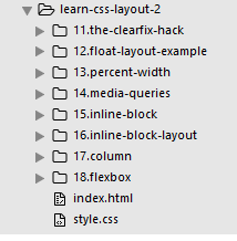
Each of the folders contains a single html + css file. These are largely empty and will be the focus of the experiments in this lab. You will be adding elements/rules to the html/css files (and examining the results in a browser). Each folder will focus on a different aspect of CSS layout techniques.
the clearfix hack
For the following experiments, work in the 11.the-clearfix-hack folder.
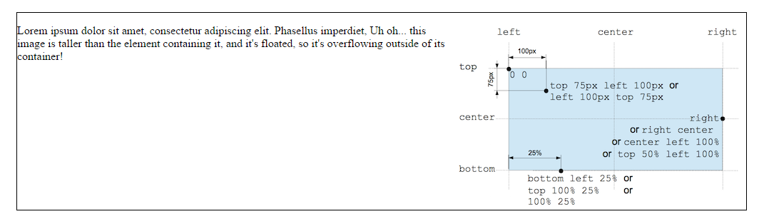
Sometimes when float is used, content can overflow beyond its container.
Open the file in a browser and see how the image is displayed within the <p> element.
To fix this we make the second <div> a member of the clearfix class as shown here
<div class="clearfix">
    <p>
      <img src="css-positioning.png" alt="An Image">
      Lorem ipsum dolor sit amet, consectetur adipiscing elit. Phasellus imperdiet, Uh oh... this image is taller than the element containing it, and it's floated, so it's overflowing outside of its container!
    </p>
</div>
In the css file add the following to the existing rules:
.clearfix{
    overflow: auto;
}
Now save and refresh the browser page. The border now contains the image completely.
float layout example
It is common to do entire layouts using float. Here is the same layout we did last week using position, but this time we use float.
Open the 12.float-layout-example folder.
In the index.html file you have a <nav> element and two <section> elements.
In the css we will float the <nav> elment to the left and set the margin on the <section> elements to be the width of the <nav> element.,
nav {
  float: left;
  width: 200px;
  border: solid 1px;
}

section {
  margin-left: 200px;
  border: solid 1px;
}

.clearfix {
  overflow: auto;
}
We include the .clearfix here just to ensure that if the nav ever increased to be longer than the sections, or if the sections shrunk to be smaller than the nav that it would not overflow its container (because it is floated left).
percent width
For the following experiments use the files in 13.percent-width folder
Percent is a measurement unit relative to the containing block. It's great for images: here we can make the image that it is always 50% the width of its container.
Edit the style.css file and add the following:
article img {
  float: right;
  width: 50%;
}
By including this rule we float the image to the right of the other content. Open the index.html page and view the result. Fix the overflow of the image using clearfix.
Refresh the index.html page in the percent-width folder and try shrinking the viewport down to see what happens. The image should always show as 50% of the container size.
You could always use max-width to limit how big the image can grow to. It is worth experiementing with min-width aswell.
You can use percent for layout (instead of position), but this can require more work.
Add the following to the css file:
nav {
  float: left;
   width: 25%;
   border: solid 1px;
}

section {
  margin-left: 25%;
  border: solid 1px;
}
In this example, the nav content starts to degrade in how it looks when the window is too narrow. It comes down to what works for your content.
media queries
For the following experiments use the files in 14.media-queries folder
Ideally you want your web development to be "Responsive" so that it resonds to changes in the device it is viewd on. It should look good no matter what.
Media queries are the most powerful tool for doing this. Let's take the layout that uses percent widths and have it display in one column when the browser is too small to fit the menu in the sidebar.
add the following to your css file
@media screen and (min-width:600px) {
  nav {
    float: left;
    width: 25%;
    border: solid 1px;
  }
  section {
    margin-left: 25%;
    border: solid 1px;
  }
}
@media screen and (max-width:599px) {
  nav li {
    display: inline;
  }
}
What happens here to our rules?
When the screen is 600px wide or larger the rules for nav and section are applied to our content. Thus we see two columns with borders, one for the nav and one for the sections.
When the screen is less than 600px wide the only rule applied is to change the default display property for the list items from block to inline, all the other content is rendered underneath.
Now our layout looks great even on mobile browsers. Here are some popular sites that use media queries:
There is a whole lot more that you can detect using media queries, you are not just restricted to min-width and max-width. Check out the options here:
Experiment with what happens if you want the li elements to infact show as a block? try commenting out the rule for screens smaller than 600px. What happens?
You can also make your layout look even better on mobile using meta viewport:
inline-block
For the following experiments use the files in 15.inline-block folder
You can create a grid of boxes that fills the browser and wraps nicely. This has been possible for a long time using float. But now with inline-block it's even easier. inline-block elements are like inline elements but they can have a width and height.
This is the hard way of doing it (using float). Add the following rules to your css file:
.box {
  float: left;
  width: 200px;
  height: 100px;
  margin: 1em;
  border: solid 1px;
}

.after-box {
  clear: left;
  border: solid 1px;
}
Save and refresh the page. You should now see boxes filling 80% of the width of the body. Each box is floated left with a specific height and width with a border and margin.
The last box must clear the others.
This is the easier way of doing it using inline-block. Replace the previous rules with the following rules:
.box {
  display: inline-block;
  width: 200px;
  height: 100px;
  margin: 1em;
  border: solid 1px;
}

.after-box {
  border: solid 1px;
}
Save and refresh the page. Some older browsers do give trouble in their support of inline-block.
inline-block layout
For the following experiments use the files in 16.inline-block-layout folder
You can use inline-block for layouts (as opposed to position or float).
There are things to keep in mind:
- inline-block elements are affected by vertical-align property, which you probably want to set to top.
- You need to set the width of each column
- There will be a gap between the columns if there is any whitespace between them in the HTML
Open the css file and add the following rule:
nav{
  display: inline-block;
  vertical-align: top;
  width: 25%;
}
.column{
  display: inline-block;
  vertical-align: top;
  width: 74%;
}
This will display the navigation to the left taking up 25% of the body, and the column will display to the right taking up 74% of the body. (The other 1% is taken up in default padding for inline-blocks)
column
For the following experiments use the files in 17.column folder
There is a new set of CSS properties that let you easily make multi-column text. View the index.html page in the browser to see its current format.
Add the following rule to the css file:
.three-column {
  padding: 1em;
  -moz-column-count: 3;
  -moz-column-gap: 1em;
  -webkit-column-count: 3;
  -webkit-column-gap: 1em;
  column-count: 3;
  column-gap: 1em;
}
Add the code in the html file to ensure that the <p> element is a member of the three-column class.
Save all files and refresh the page.
CSS columns are very new, so you need to use the prefixes, and it won't work through IE9 or in Opera Minin. There are some more column-related properties:
flexbox
The new Flexbox layout mode is set to redefine how we do layouts in CSS. Unfortunately the specification has changed a lot recently, so it's implemented differently in different browsers. Still, these are examples that currently work in some browsers - http://caniuse.com/#feat=flexbox that use the latest version of the standard.
There are a lot of out-of-date flexbox resources around. If you want to learn more about flexbox,
A detailed article using the latest syntax on flexbox:
There is a lot more you can do with flexbox; these are just a few examples to give you an idea.
simple layout using flexbox
Open the folder 18.flexbox and edit the css file. Add the following rules:
.container {
    display: -webkit-flex;
    display: flex;
}

nav {
    width: 200px;
}

.flex-column {
    -webkit-flex: 1;
            flex: 1;
}
Next in the index.html file name the outer <div> element to be a member of the "container" class.
Name the inner <div> element to be a member of the "flex-column" class. This means the two sections flex into 1 column
fancy layout using flexbox
In the same css file you already have open add the following rules:
.initial {
        width: 200px;
    min-width: 100px;
}

.none {
  -webkit-flex: none;
          flex: none;
  width: 200px;
}
.flex1 {
  -webkit-flex: 1;
          flex: 1;
}
.flex2 {
  -webkit-flex: 2;
          flex: 2;
}
Now open the fancy.html file and appropriately name each div as a member of the correct class. The outer div is the container and then each subsequent div is a member of each class as you have written them in the css rules.
Centering using flexbox
Add the following to the css file:
.vertical-container {
    height: 300px;
    display: -webkit-flex;
    display: flex;
    -webkit-align-items: center;
    align-items: center;
    -webkit-justify-content: center;
    justify-content: center;
}
Open the centering.html file and ensure the div is a member of the vertical-container class. Save and load the page.
Solution
Here is an archive of the completed lab:
You can browse the completed lab sessions from here: