Objectives
Review CSS fundamentals Layout fundamentals via a series of discreet experiments. Each experiment is in a separate html/css file and explores important rules associated with the box model, layout and positioning via simple, concrete examples. Some of the material is drawn from the excellent http://learnlayout.com resource.
Lab setup up
For all of the steps in this lab, you will use the following project:
Download and unzip this file, and open it in sublime. Remember, dragging/dropping the folder into Sublime should enable you to see something like this:

Each of the folders contains a single html + css file. These are largely empty and will be the focus of the experiments in this lab. You will be adding elements/rules to the html/css files (and examining the results in a browser). Each folder will focus on a different aspect of CSS layout techniques.
no layout
For the following experiments, work in the 01.no-layout folder.
Having no layout whatsoever is almost ok if all you want is one big column of content. However, if a user makes the browser window really wide, it gets kind of annoying to read: after each line your eyes have a long distance to travel right-to-left to the next line.
Paste an example paragraph into the body:
  <p>
    Vel et enim consulatu. Te civibus copiosae salutandi vel. Adhuc sonet libris ad eam,
    mundi affert mea ex. Dicunt feugiat patrioque et mel, id qui nusquam maluisset, ei vim
    justo ceteros vituperata. Mei saepe mediocrem ut. Repudiare definitiones ea ius, sint
    commodo est ea, nam no nemore diceret.
  </p>
Open the file in a browser and try various sizes.
Before we fix this problem, let's make sure we're clear on the very important display property.
the "display" property
For the following experiments, work in the 01.the-display-property folder.
Display is CSS's most important property for controlling layout. Every element has a default display value depending on what type of element it is. The default for most elements is usually block or inline. A block element is often called a block-level element. An inline element is always just called an inline element.
block
div is the standard block-level element. A block-level element starts on a new line and stretches out to the left and right as far as it can. Other common block-level elements are p and form, and new in HTML5 are header, footer, section, and more.
inline
span is the standard inline element. An inline element can wrap some text inside a paragraph <span> like this </span> without disrupting the flow of that paragraph. The a element is the most common inline element, since you use them for links.
none
Another common display value is none. Some specialized elements such as script use this as their default. It is commonly used with JavaScript to hide and show elements without really deleting and recreating them.
This is different from visibility. Setting display to none will render the page as though the element does not exist. visibility: hidden; will hide the element, but the element will still take up the space it would if it was fully visible.
other display values
There are plenty of more exotic display values, such as list-item and table. Here is an exhaustive list. We'll discuss inline-block and flex later on.
Experiments:
Bring in these elements into the html file:
  <div class="status-1">
    div is the standard block-level element. A block-level element starts on a new line and stretches out to the left and right as far as it can. Other common block-level elements are p and form, and new in HTML5 are header, footer, section, and more.
  </div>

  <div class="status-2">
    Here is another example for test purposes
  </div>

  <div class="status-3">
    And this is a final paragraph. We will conduct some experiments in hiding and showing these paragraphs.
  </div>
..and these CSS rules:
.status-1 {
  display:block;
}

.status-2 {
  visibility: hidden;
}

.status-3 {
  display:block;
}- Change one of the
blockproperties tononeand observe the results. - Remove the
visibility:hiddenline an observe the results
margin: auto;
For the following experiments, work in the 03.margin-auto folder.
Setting the width of a block-level element will prevent it from stretching out to the edges of its container to the left and right. Then, you can set the left and right margins to auto to horizontally center that element within its container. The element will take up the width you specify, then the remaining space will be split evenly between the two margins.
Include the following elements in the html document:
  <p>
    Lorem ipsum dolor sit amet, eos ut diam interesset, cu modo necessitatibus pri. Ne sit
    elit dicit, eum dico autem convenire an. Sed ei clita nullam, elit legimus
    voluptatibus ei his. Duo facilisi cotidieque at, invidunt platonem incorrupte ut has.
  </p>
  <p>
    Vel et enim consulatu. Te civibus copiosae salutandi vel. Adhuc sonet libris ad eam,
    mundi affert mea ex. Dicunt feugiat patrioque et mel, id qui nusquam maluisset, ei vim
    justo ceteros vituperata. Mei saepe mediocrem ut. Repudiare definitiones ea ius, sint
    commodo est ea, nam no nemore diceret.
  </p>
Open in the browser and observe the margins.
Now bring this into the css file:
body {
  width: 600px;
  margin: 0 auto;
}
.. and refresh. Also observer behavious as window is resized.
The only problem occurs when the browser window is narrower than the width of your element. The browser resolves this by creating a horizontal scrollbar on the page. Let's improve the situation...
max-width
For the following experiments, work in the 03.max-width folder.
Using max-width instead of width in this situation will improve the browser's handling of small windows. This is important when making a site usable on mobile.
body {
  max-width: 600px;
  margin: 0 auto;
}
Using the same text we had previously, resize this page to check it out. The difference is quite subtle.
You can also set the max-width to a percentage - try this:
body {
  max-width: 80%;
  margin: 0 auto;
}
Note how this varies from pixels when the page is very narrow.
box model
For the following experiments, work in the 05.box-model folder.
While we're talking about width, we should talk about width's big caveat: the box model. When you set the width of an element, the element can actually appear bigger than what you set: the element's border and padding will stretch out the element beyond the specified width.
Look at the following example, where two elements with the same width value end up different sizes in the result.
Hers are the elements:
  <div class="simple">
    <p>
      I'm smaller...
    </p>
  </div>
  <div class="fancy">
    <p>
      And I'm bigger!
    </p>
  </div>
Your starter css already includes:
body {
  max-width: 80%;
  margin: 0 auto;
}
... to keep things tidy. Now add:
.simple {
  width: 500px;
  margin: 20px auto;
  border: dashed 1px;
}

.fancy {
  width: 500px;
  margin: 20px auto;
  padding: 50px;
  border: dashed 1px;
}
Browse now and observe the results. The difference in size is because the padding is added to the width.
(Note that in this a subsequent examples we are turning on a dash border to make the structural aspects of the page visible)
Box Sizing
For the following experiments, work in the 06.box-sizing folder.
Over the generations, people realized that box calculations cab be error prone, so a new CSS property called box-sizing was created.
When you set box-sizing: border-box; on an element, the padding and border of that element no longer increase its width.
Using these elements as the last step:
  <div class="simple dashed">
    <p>
      We're the same size now!
    </p>
  </div>
  <div class="fancy dashed">
    <p>
      Hooray!
    </p>
  </div>
Your started css includes this already:
body {
  width: 600px;
  margin: 0 auto;
}

.dashed {
  border: dashed 1px;
}
Now add this:
.simple { width: 500px; margin: 20px auto; -webkit-box-sizing: border-box; -moz-box-sizing: border-box; box-sizing: border-box; }
.fancy { width: 500px; margin: 20px auto; padding: 50px; -webkit-box-sizing: border-box; -moz-box-sizing: border-box; box-sizing: border-box; }
Since this is so much better, some authors want all elements on all their pages to always work this way. Such authors put the following CSS on their pages:- {
-webkit-box-sizing: border-box;
-moz-box-sizing: border-box;
} ~~~box-sizing: border-box;
This ensures that all elements are always sized in this more intuitive way.
Since box-sizing is pretty new, you should use the -webkit- and -moz- prefixes for now. This technique enables experimental features in specific browsers.
Here is a 'canonical' set of rules we will include in most of our CSS files from now on:
* {
  -webkit-box-sizing: border-box;
     -moz-box-sizing: border-box;
          box-sizing: border-box;
}

body {
  width: 80%;
  margin: 0 auto;
}

.dashed {
  border: dashed 1px;
}
These rules :
- setting the
border-boxsizing for all elements - setting the overall page width to 80% of the page
- establishing a
dashedclass we might use for exploration purposes. We can use this when we want to see the boundaries of sections as we are exploring various options.
position
For the following experiments, work in the 07-position folder.
In order to make more complex layouts, we need to discuss the position property. It has a bunch of possible values, and their names make no sense and are impossible to remember. Let's go through them one by one, but maybe you should bookmark this page too.
static
static is the default value. An element with position: static; is not positioned in any special way. A static element is said to be not positioned and an element with its position set to anything else is said to be positioned.
To prove it, introduce this element:
  <div class="static dashed">
    <p>
      Vel et enim consulatu. Te civibus copiosae salutandi vel. Adhuc sonet libris ad eam,
      mundi affert mea ex. Dicunt feugiat patrioque et mel, id qui nusquam maluisset, ei vim
      justo ceteros vituperata. Mei saepe mediocrem ut. Repudiare definitiones ea ius, sint
      commodo est ea, nam no nemore diceret.
    </p>
  </div>
  <br>
... and this rules:
.static {
  position: static;
}
Removing the poistion:static; entry should make no difference (try it).
relative
relative behaves the same as static unless you add some extra properties.
Bring in this element:
  <div class="relative1 dashed">
    <p>
      Te iriure moderatius vis, nam prodesset honestatis te. Atqui facilisi at est. Ex duo vocent
      incorrupte eloquentiam. Agam deterruisset vel at, has no illum ipsum alterum. Virtute vivendo
      officiis his et, ius viris tollit homero ad. In sit euismod salutatus, cu eos malorum
      luptatum consulatu, et nec debet antiopam.
    </p>
  </div>
... and this CSS:
.relative1 {
  position: relative;
}
Because we have specified relative without any extra parameters, there is no real effect to observe.
Now try this:
  <div class="relative2 dashed">
    <p>
      Saperet maiestatis instructior te per, cu vel tota cotidieque. Vix illum regione deterruisset
      cu, ne cum diam suavitate complectitur, nec ex erant principes. Augue omittam no sea, putant
      forensibus usu te. Te iusto dicam verear mei. Dolorum posidonium no vel.
    </p>
  </div>
... with this additional rule:
.relative2 {
  position: relative;
  top: -20px;
  left: 20px;
  width: 500px;
}
Setting the top, right, bottom, and left properties of a relatively-positioned element will cause it to be adjusted away from its normal position. Other content will not be adjusted to fit into any gap left by the element
fixed
A fixed element is positioned relative to the viewport, which means it always stays in the same place even if the page is scrolled. As with relative, the top, right, bottom, and left properties are used.
Try this:
  <div class="fixed dashed">
    <p>
      Hello! How did I get here?
    </p>
  </div>
... with this:
.fixed {
  position: fixed;
  bottom: 0;
  right: 0;
  width: 200px;
}
This should fix an element to the lower right of the canvas. Change the window dimensions and observe what happens to that element.
absolute
absolute is the trickiest position value. absolute behaves like fixed except relative to the nearest positioned ancestor instead of relative to the viewport. If an absolutely-positioned element has no positioned ancestors, it uses the document body, and still moves along with page scrolling. Remember, a "positioned" element is one whose position is anything except static.
Here is a simple example:
.relative {
  position: relative;
  width: 600px;
  height: 400px;
}
.absolute {
  position: absolute;
  top: 120px;
  right: 0;
  width: 300px;
  height: 200px;
}
This stuff is tricky, but it's essential to creating great CSS layouts. On the next page we'll use position in a more practical example.
position example
For the following experiments, work in the 08.position-example folder.
Bring in the following content:
  <div class="container dashed">
    <nav>
      <ul>
        <li> <a href="#">Home</a>       </li>
        <li> <a href="#">Taco Menu</a>  </li>
        <li> <a href="#">Draft List</a> </li>
        <li> <a href="#">Hours</a>      </li>
        <li> <a href="#">Directions</a> </li>
        <li><a href="#">Contact</a>     </li>
      </ul>
    </nav>
    <section class="dashed">
      <p>
        The <code>margin-left</code> style for <code>section</code>s makes sure there is room for the <code>nav</code>. Otherwise the absolute and static elements would overlap
      </p>
    </section>
    <section class="dashed">
      <p>
        Lorem ipsum dolor sit amet, consectetur adipiscing elit. Phasellus imperdiet, nulla et dictum
        interdum, nisi lorem egestas odio, vitae scelerisque enim ligula venenatis dolor. Maecenas
        nisl est, ultrices nec congue eget, auctor vitae massa. Fusce luctus vestibulum augue ut
        aliquet. Mauris ante ligula, facilisis sed ornare eu, lobortis in odio. Praesent convallis
        urna a lacus interdum ut hendrerit risus congue. Nunc sagittis dictum nisi, sed ullamcorper
        ipsum dignissim ac. In at libero sed nunc venenatis imperdiet sed ornare turpis. Donec vitae
        dui eget tellus gravida venenatis. Integer fringilla congue eros non fermentum. Sed dapibus
        pulvinar nibh tempor porta. Cras ac leo purus. Mauris quis diam velit.
      </p>
    </section>
    <section class="dashed">
      <p>
        Notice what happens when you resize your browser. It works nicely!
      </p>
    </section>
    <footer class="dashed">
      <p>
        If you use a fixed header or footer, make sure there is room for it! I put a <code>margin-bottom</code> on the <code>body</code>.
      </p>
    </footer>
  </div>
Render in chrome and observe the layout.
Now try these two rules:
nav {
  position: absolute;
  left: 0px;
  width: 200px;
}

section {
  margin-left: 200px;
}
This locks the nav in at the top left, with the sections overlaying - but the margin keeps them from interfering with the nav. Try removing the margin-left: 200px property to see the difference.
Now try this new rule:
footer {
  position: fixed;
  bottom: 0;
  left: 0;
  height: 50px;
  width: 100%;
}
You should see the footer cling the the end of the viewport.
Resize the window, and notice how the main sections will scroll behind the footer. If we dont like this behaviour, we can match the footer height with a corresponding margin entry in the the 'body' rule:
body {
  margin-bottom: 100px;
}
Detecting the difference between including/excluding the above rule will take a bit of resizing/reload experiments. Essentially, if we leave the rule out then part of the content of our page will be completely excluded in certain circumstances. If we include it, then the entire page will always be visible - even if we need to scroll.
float
For the following experiments, work in the 09.float folder.
Another CSS property used for layout is float. Float is intended for wrapping text around images.
Download this image here and store it in the 09.float folder:
Now bring in this element:
<p>
<img src="css-positioning.png" alt="An Image">
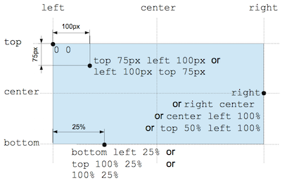
the position CSS data type denotes a coordinate in a 2D space used to set a location relative to a box. A specific
coordinate can be given by a two keywords, with specific offsets. A keyword represent one edge of the element's box or
the medium line between two edges: left, right, top, bottom or center (which represents either the center between the
left and right edges, or the center between the top or bottom edges, depending on the context). An offset can be
either a relative value, expressed as a percentage, or an absolute length value. Positive values are offset towards
the right or towards the bottom, whichever is suitable. Negative values are offset in the other.
</p>Render the above in chrome and observe the results.
Now try this additional rule here:
img {
  float: right;
  margin: 0 0 1em 1em;
}
... and notice the changed positioning of the image.
clear
For the following experiments, work in the 10.clear folder.
The clear property is important for controlling the behavior of floats.
Bring in these elements:
  <section class="box dashed">
    <p>
      Lorem ipsum dolor sit amet, eos ut diam interesset, cu modo necessitatibus pri.
    </p>
  </section>
  <section class="dashed">
    <p>
      Vel et enim consulatu. Te civibus copiosae salutandi vel. Adhuc sonet libris ad eam,
      mundi affert mea ex. Dicunt feugiat patrioque et mel, id qui nusquam maluisset, ei vim
      justo ceteros vituperata. Mei saepe mediocrem ut. Repudiare definitiones ea ius, sint
      commodo est ea, nam no nemore diceret.
    </p>
  </section>
Try this rule:
.box {
  float: left;
  width: 30%;
}
Look carefully at what has happened: In this case, the section element is actually after the div. However, since the div is floated to the left, this is what happens: the text in the section is floated around the div and the section surrounds the whole thing.
What if we wanted the section to actually appear after the floated element?
Introduce this new rule:
.after-box {
  clear: left;
}
... and we will give the second paragraph this class:
  <section class="after-box dashed">
    <p>
      Vel et enim consulatu. Te civibus copiosae salutandi vel. Adhuc sonet libris ad eam,
      mundi affert mea ex. Dicunt feugiat patrioque et mel, id qui nusquam maluisset, ei vim
      justo ceteros vituperata. Mei saepe mediocrem ut. Repudiare definitiones ea ius, sint
      commodo est ea, nam no nemore diceret.
    </p>
  </section>
Solution
Here is an archive of the completed lab:
You can browse the completed lab sessions from here: